TRACK YOUR TAXI
A service product concept rethinking the ride-tracking experience. Real-time motion, contextual payment information, and a mobile-first system designed entirely for one-handed use in motion.
Ride-tracking apps create anxiety. They shouldn't.
This was a concept piece with a sharp question behind it: what would a taxi tracking app look like if you designed it entirely around how the passenger feels, instead of around dispatch and driver management?
Most ride apps are built operator-first. You end up looking at what the system happens to track, not at what you actually want to know in the back of a car. We flipped the priority.
The constraint kept us honest: every interaction had to work one-handed, in a moving vehicle, in bad lighting. No hidden menus, no swipe gymnastics. Just calm, contextual information when you need it.
What we'd watch next time: putting everything on one map surface is great until the screen gets busy. Layering fare, ETA, route changes, and split-pay onto a live map without it turning into clutter was the genuinely hard part, and it's the thing we'd want to pressure-test with real drivers and real traffic before calling it finished.
What we set out to solve.
Four convictions about how the ride feels from the back seat — each one bet on calm over control panels.
When you can't see where your driver is, the silence fills with worry. The whole concept started from designing for that feeling, not for the map data underneath it.
The riskiest stretch is right after booking, before the driver feels real on screen. We focused the early experience on making that wait feel handled, not abandoned.
Fare and split-pay context belong in front of you during the ride, not buried in a receipt afterwards. Knowing what you owe is part of feeling in control.
Switching between a map and a separate booking summary breaks the sense of a single live moment. We bet everything on keeping it all on one surface.
How we designed it.
Three weeks, four phases — framing the feeling first, then building the map into the whole interface.
PROBLEM FRAMING
We started by getting specific about the feeling we were designing against: the low hum of anxiety when you've booked a ride and have no idea what's actually happening. Existing apps show you what the system tracks. We wanted to show the passenger what they need to know. So we mapped the emotional journey from tap-to-book through to the car pulling up.
MOBILE-FIRST SYSTEM DESIGN
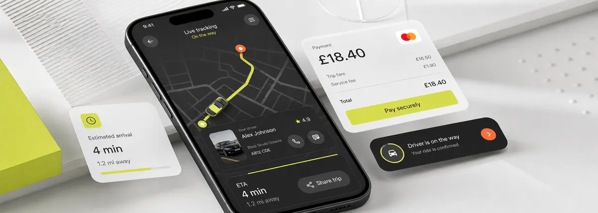
Everything got designed for one hand, in a moving car. The map isn't a tab you open — it's the app itself. Driver details, ETA, route changes, and fare context all live as layers on the map instead of being scattered across separate screens and bottom sheets you have to go hunting for.
PAYMENT & CONTEXT LAYER
Payment lives inside the live ride view: a running fare estimate, a way to start a split, and a receipt preview. You can split the fare mid-journey without ever leaving the tracking screen. This was the idea we were most excited about — money is the thing people quietly stress over, and putting it in plain sight takes the edge off.
REFINEMENT & HANDOVER
We put the prototype in front of people and watched where they hesitated. The clearest lesson: dropping the bottom navigation bar and surfacing everything in context made the whole thing feel calmer and easier to follow. We delivered the final designs with full Figma source, motion specs, and a walkthrough so the team could pick it up and run.
The calls that defined it.
Three decisions we committed to early — and held, even when they meant throwing out the usual patterns.
MAP AS PRIMARY UI
The map is not a modal or a secondary screen — it IS the app. All information is overlaid contextually. Navigation tabs are replaced by gesture-based context switching.
FARE CONTEXT VISIBLE IN MOTION
Running fare estimate, payment method, and split pay button are always visible without tapping. Passengers know what they owe before they arrive. No surprises.
ONE-HAND THUMB ZONE ONLY
Every interactive element lives in the bottom 40% of the screen — the natural thumb reach zone. Nothing requires a two-thumb gesture or a visual search.
What we delivered.
A single live surface, designed end to end and handed over with full source — in twenty-one days.
One map-first screen carrying tracking, driver detail, ETA, and payment context — no tabs, no bottom nav, nothing to go hunting for mid-ride.
Problem framing, system design, interaction specs, and Figma handover wrapped in 21 days. On time, to brief.
Complete Figma source, component library, motion specs, and a walkthrough session delivered on completion day.